From clinical to caring.
Redefining Alphalink Clinic's logo design to reflect your core promise: "Caring for life."
The Challenge
A new direction needed
After receiving an initial proposal that didn't align with their vision, Alphalink Clinic reached out to us for a fresh approach. The previous design was cluttered, lacked versatility across applications (stationery, digital media, signage), and relied on stereotypical healthcare imagery. The client needed something simpler, more distinctive, and adaptable—reflective of their brand colors while working seamlessly across all touchpoints.
Our Interpretation
Create a clean, minimalist mark built from a geometric cross—something straightforward and modern, not cluttered or trendy.
Use their brand colors (blue and green) strategically to add meaning and visual interest while maintaining simplicity and clarity.
Exploration & Strategy
Structural & Semantic Development
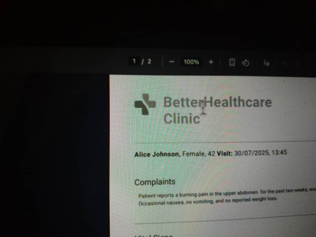
Our initial sketches focused on finding a structural composition that balanced the medical cross with a sense of connection and approachability, moving away from common clichés. We used your reference image to guide the minimalist, geometric aesthetic.
Reference Analysis
Deconstructing the Client's Vision
The "BetterHealthcare Clinic" reference provided a structural logic of simplicity and dual-tonal balance.
- Geometry: Use soft, rounded geometry to feel approachable and modern, not harsh.
- Balance: Strategically balance two colors (Blue and Green) to create depth and meaning.
We adopted this logic to create a proprietary mark that functions as an abstract representation of a person with open, welcoming arms. This symbolizes care, compassion, and the human connection at the heart of Alphalink's mission—while maintaining the structural integrity of the medical cross.

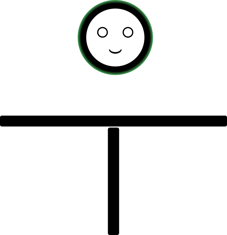
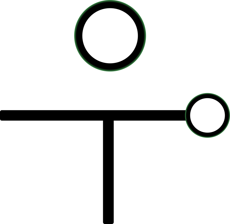
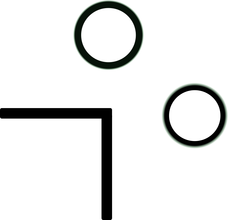
Early structural concepts
The Solution
Harmony in Intersection
The final mark is a pure geometric distillation of the medical cross, built on three core pillars of meaning, inspired by your mission.
Foundation of Trust
The prominent blue element represents stability, calm, and clinical reliability—the bedrock of your professional service.
Healing & Continuity
The green elements represent healing, care, and the continuity of life. The gradient in the right arm adds depth and vitality, symbolizing organic growth.
Welcoming Humanism
Inspired by the tagline "Caring for life," the icon's structure intentionally resembles a person with stretched, welcoming arms, embracing all who come with care.
Your Comprehensive Brand System
A unified framework ensuring consistency across all medical touchpoints, structured for clarity and global standards.
Color Palette
a color
Typography & Tone
Primary Type: Roboto (Clarity)
Type below to testSecondary Type: Merriweather (Warmth)
Type below to testImagery & Voice: "Medical Humanism"
Logo Architecture & Usage Guidelines
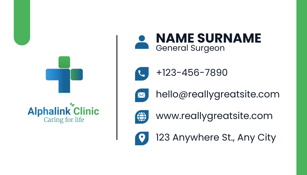
Primary Lockup (Stacked)
The definitive brand signature. This vertical composition integrates the geometric cross, the dual-color logotype, and the serif tagline "Caring for life". The centered axis projects stability and authority.
Usage Context
- Vertical Signage & Totems
- Official Documents (Cover Pages)
- Social Media Avatars
Linear Configuration (Horizontal)
Optimized for lateral efficiency. This variation separates the logotype into a distinct reading order—Symbol first, followed by the "Alphalink" (Blue) and "Clinic" (Green) wordmark. Note the organic leaf accent bridging the two words.
Usage Context
- Website Headers & Navigation
- Building Facades (Wide format)
- Stationery Headers
Applications Showcase
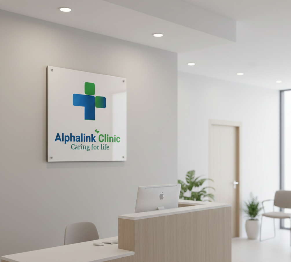
1. Exterior Signage
Utilizing the Secondary (Horizontal) mark for maximum legibility from a distance. The "Caring for life" tagline is engraved on a separate plaque to maintain the logo's clean lines.
- Logo Text & Icon: Main "Alphalink Clinic" in bold geometric Roboto as 3D channel letters (Blue for "Alphalink", Green for "Clinic"); illuminated cross and leaf icon.
- Tagline Plaque: Mounted beneath the main sign, centered; Merriweather Regular, engraved into a polished dark grey or brushed aluminum plaque with "Caring for life" filled in Clinic Green.
2. Clinical Stationery
Clean, authoritative layouts using Roboto for data and Merriweather for the brand voice. The layout prioritizes white space to convey hygiene and order.
- Letterhead: Full-color logo (Stacked or Horizontal depending on space) positioned top-right; footer address in lightweight Roboto; tagline in Merriweather Regular Italic.
- Forms: Utilize the dual-color system for data separation and hierarchy.
3. Medical Staff Scrubs
The Primary (Stacked) mark is embroidered on the left chest. The simplicity of the icon ensures it remains recognizable even at small stitching sizes.
- Staff Uniform (Left Chest): Full logo embroidered on left chest pocket using Roboto for the text and Clinic Green for the tagline when applicable.
- Tagline Detail (Sleeve/Yoke): Merriweather Bold or Semibold embroidered in Clinic Green on cuff or centered below neck yoke; ensure high stitch weight for serif legibility.
